The Power of Inclusive Design
Ashley Morris, one of Coven's talented Senior Designers, has a passion for design inclusivity that runs deep in her creative DNA—and we love her for it. Follow along as she shares how to shift your design process to prioritize accessibility.
"In essence, it is not what it looks like but what it does that defines a symbol."
– Paul Rand, Thoughts on Design
I remember being in 6th grade, quietly coloring in some boxes on an assignment when a boy asked, “What color is this pencil?” Shortly after, he asked about another. At the time, I was confused why he needed me to give him answers to very obvious colors. After class, he confided in me that because there was no name on these colored pencils, he couldn’t distinguish one from the other due to being colorblind.
This interaction has always stuck with me. Later in life, as I entered the world of design, I realized I had witnessed someone being excluded by design (the pencil) in 6th grade. Reflecting on it further, I realized I had experienced exclusion too—being left-handed made using scissors and seating arrangements unnecessarily difficult.
The Power of Design
Design has the power to impact and educate, but it can also be physiologically and emotionally damaging when it excludes people. Exclusion can stem from the lack of diversity in decision-making rooms or a lack of knowledge about accessibility. Intentional or not, the effects remain the same.
Where the brief stops, our role as designers begins. Inclusive design prioritizes accessibility and clarity throughout the creative process. It takes practice, patience, and a bit of humility until inclusivity becomes second nature. How important is our role as designers? Let's see what the numbers say.
Color is About More than Compliance
As Kat Holmes mentions in Mismatch, “...human ability is the building block of design" (pg. 49). Design relies on human interaction and connection. It can also be the solution to its own problems when approached holistically and with accessibility in mind.
To put the importance of inclusive design into perspective, consider these statistics:
1 billion people experience a disability. If you do not now, you most likely will at some point in your life (Mismatch, World Bank).
1 in 12 men and 1 in 200 women have a color vision deficiency.
Around 300 million people have color blindness (equivalent to the population of the USA).
The most common color deficiencies make it hard to distinguish red from green. Others affect blue and yellow.
We can determine color blindness through tests like the Ishihara Test. While people with typical color vision see numbers in the circles, those with color blindness may see only a blank circle.
Can you see the numbers?

Well, can you? The answers are 5, 6, 26.
Futureproofing Brands Through Design
Start by partnering with your team on inclusive conversations.
When we design for a wider audience, we expand brand reach and create more meaningful experiences. By considering those who experience extreme exclusion, like color blindness, we can build brands with inclusivity at their core.
Some key considerations:
Avoid placing red and green side by side.
Ensure brand colors meet AA standards established by WCAG (Web Content Accessibility Guidelines).
But accessibility doesn’t stop at color contrast.
Refining Color for Accessibility
One of the most effective ways designers can ensure accessibility is by establishing sufficient contrast between brand colors. Useful tools for this include:
The AA standard requires a 3:1 contrast ratio for large body text and 4.5:1 for regular body text in digital spaces. While these standards apply to digital placements, incorporating them into branding projects ensures visibility across all touchpoints.
Shift Color Thinking to Contrast Thinking
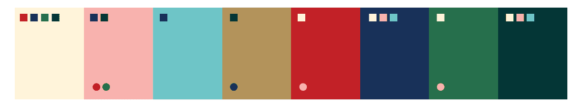
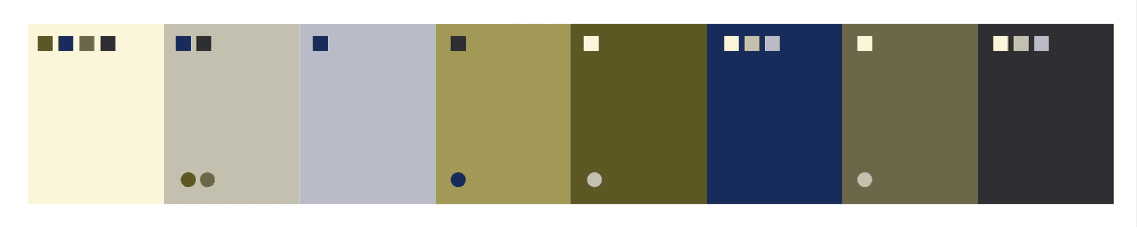
After finalizing the logo structure, I experiment with color early on, ensuring a range of contrast. Viewing palettes in black and white and different color blindness simulations helps assess their usability.
Original Palette

Black and White Palette

Colorblind Protanopia Preview

To create a balanced scheme, I define contrast ranges per color. In the example below, the top squares show the best contrast pairings for body copy, while the bottom circles highlight large text options.
Discussing accessibility from the outset allowed us to introduce an additional color that provided greater contrast, making the brand more adaptable and inclusive. Beyond just improving design, these conversations also strengthened our relationship with the client. While this makes me extremely happy as a designer, this goes a bit deeper than that.
Using Inclusion as a Selling Point to Spark Joy
As an accessibility advocate, I often bring up these statistics in branding discussions. More than once, a team member has shared their own experience with color blindness—sometimes surprising their colleagues. This highlights an important truth: everyone experiences the world differently. When we recognize this, we move beyond designing for ourselves and instead create brands that bring joy to a diverse audience.
Key Takeaways for Inclusive Design
Advocate for high-contrast colors in the early branding stages.
Consider common color deficiencies and test how your palette appears in different modes.
Always recognize that every individual sees the world differently—this is a goldmine for inclusive growth in any business.
——
Resources
Mismatch, Kat Holmes

Ready for more? Keep bantering.
