The Challenge
Our Solution
The branding demanded a visual language that harmonized with Visit Baltimore’s bold and established aesthetic. At the same time, it needed to embody the essence of Warm Welcome. We needed to capture its spirit of acceptance, support, and inspiration—while remaining authentic to the city’s dynamic personality.
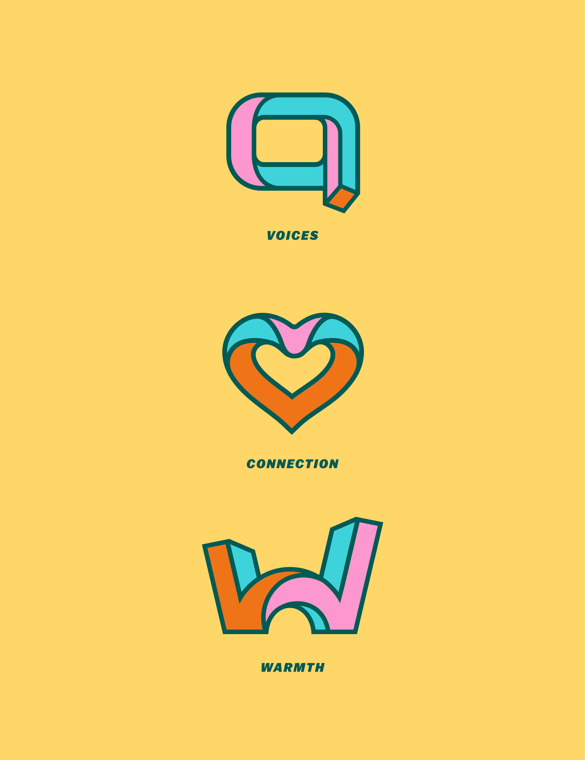
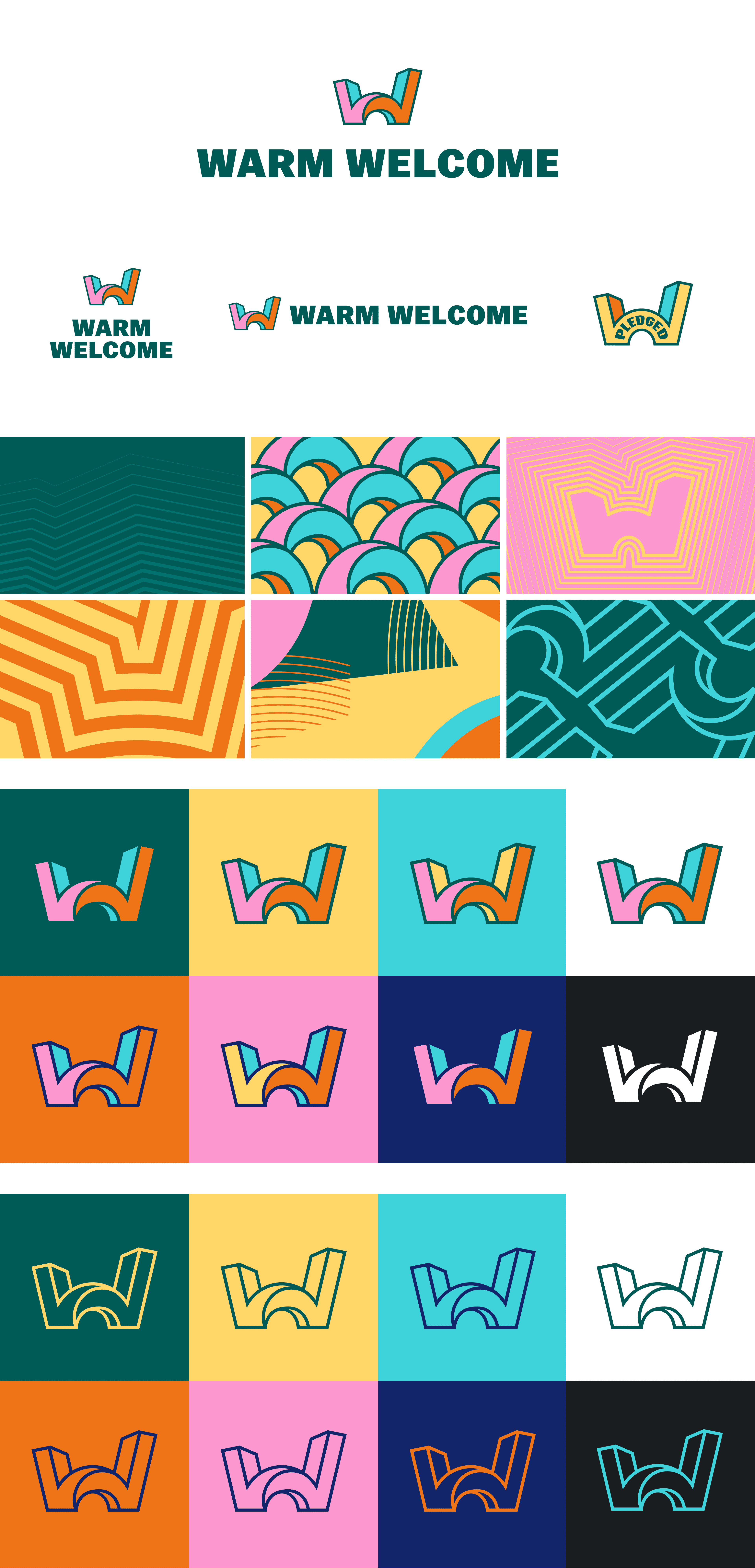
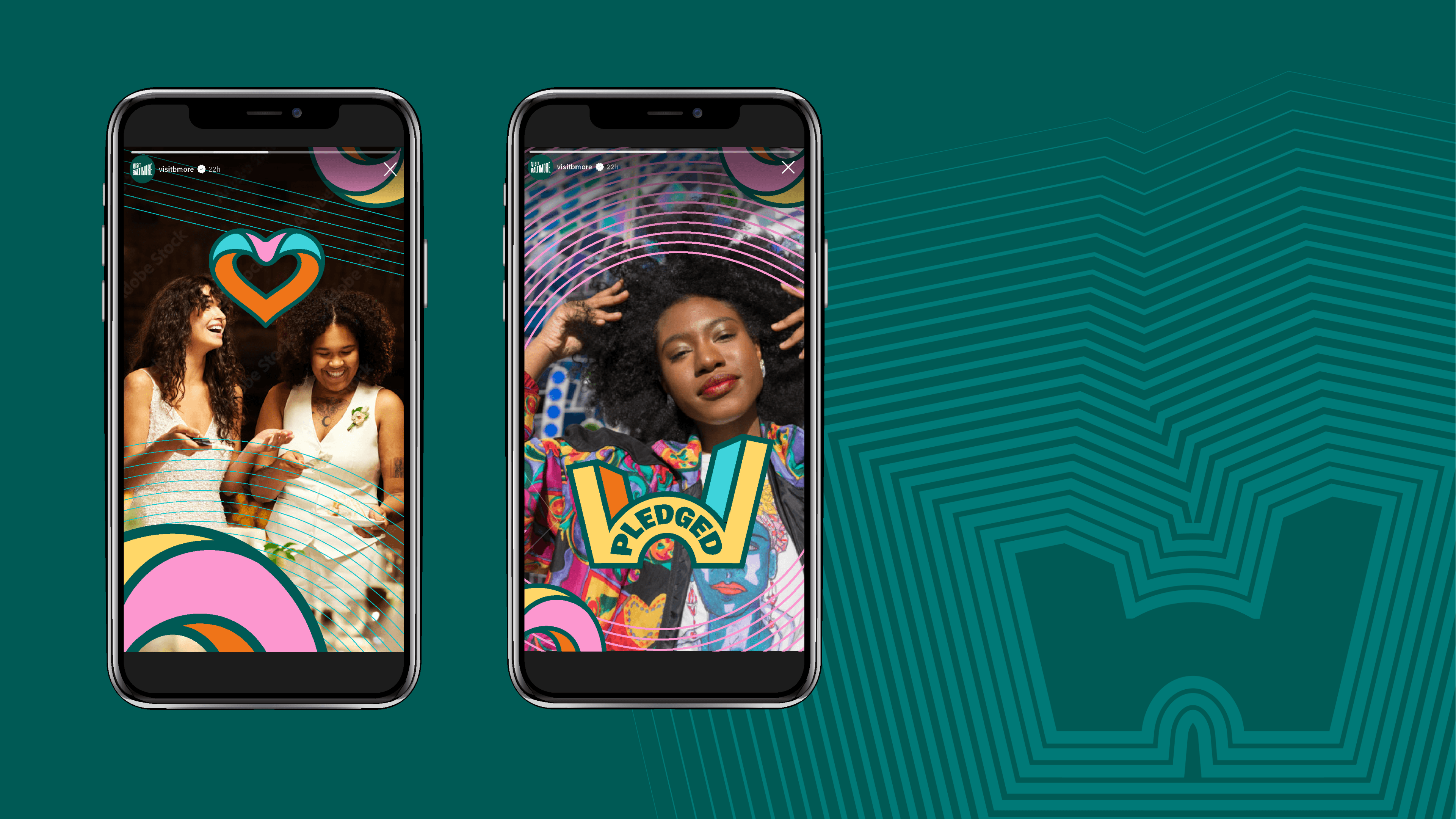
Influenced by the program’s mission to encourage fresh perspectives, the primary icon’s “W” shape reimagines city buildings, bending and morphing to symbolize infinite viewpoints. Heavy line work, shape reverberation, and playful patterns expanded this concept into a scalable, energetic identity system, breathing life into every execution.
Upon launch, the new identity garnered overwhelmingly positive feedback from Visit Baltimore’s members and stakeholders, renewing a sense of commitment to Warm Welcome’s significant purpose.


Wondering about our branding process and whether it could work for you? Let's talk.

